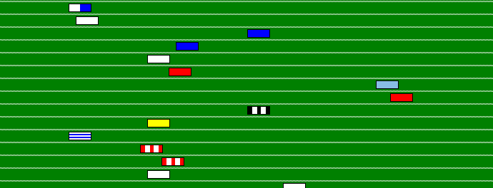
Sometimes football TV pundits talk about “the Premier League race” as though it were an actual race between the teams, rather than just a list of teams sorted in descending order of points. I thought it would be interesting to see what a Premier League season would look like if it actually was a race, so I decided to make a little animation. This post is a write up of how I did this. If you want to go straight to the animation for the 2011-2012 season you can do so.
I chose to implement this as a web page, with the animation stuff written in JavaScript. I wanted to use it as a practice project for getting good with web technologies like HTML, CSS, JavaScript and jQuery. It turns out I also used some PHP to process the result data and generate the web pages (although I could have used any language for this part because the PHP is just used to generate static html files; there’s no dynamic server-side code running).
The data I used comes from football-data.co.uk. They have free CSV files containing all the match results for the English Premier League (and many other European leagues) going back to 1993-1994.
It works like this. I have a PHP script which processes the CSV data for all the results. This produces an HTML file for each season. Inside each HTML file is a <script> element containing a JavaScript object with that season’s data. This means that when the page’s JavaScript code runs, it already has all the data it needs to display the animation. It doesn’t have to do any remote fetching or processing of results data. Since the results data doesn’t change it makes sense to only process it once, rather than every time the page is viewed.
The bulk of the data is in an object keyed by date string (in the format “yyyy-mm-dd”). There is one element in this array for each date on which there was a match, and each element contains all the teams and how many points they had after that day’s matches. This data is much simpler for the JavaScript code to deal with than if it had to process the raw results to figure out how many points a team had on a particular date. So during the animation (or when a specific date is selected) it can just go to the current date and get the data it needs.
When the page loads, the JavaScript makes a setInterval call to run the animation. Each step increments the date by one day and updates the positions of teams that gained points on that day.
I used another PHP script to generate the images for each team. This uses the PHP functions imagecreate and imagefilledrectangle to draw the appropriate shirt pattern and colours for each team. I can then automatically generate the team images with code like:
GenerateImage('west-ham', $properties, "sleeves", "#7F0000", "#80BFFF");

GenerateImage('wigan', $properties, "stripes", "#236BD8", "#FFFFFF");

GenerateImage('wimbledon', $properties, "solid", "#000066");
This makes adding new teams really easy; I just add a line to my script for each team. This was the most fun part of this project. There is something very satisfying about running a script and seeing it generate a folder full of images automatically.
I added buttons to pause and restart the animation at any time, and a date control to allow you to select a date and view the state of the race on that date.
Unlike a real race, there is no fixed finish line to reach first in order to win. The winning team is the one with the most points once all the matches have been played. But I wanted to make it clear when the animation was over, so I implemented a moving finish line. This is displayed at a position corresponding to the number of points the leading team could theoretically get if they won all their remaining matches. At the start, it is off to the right, beyond the edge of the track. As the season progresses it moves left, until at the end of the season it is at the same position as the winning team. At this point the animation also indicates the top 3 teams, and which teams were relegated. I’ve cheated a bit here. I could have calculated this in my PHP script based on the points and goal difference etc. But this is made a bit complicated by teams having points deducted sometimes (Middlesbrough in 1996-1997 and Portsmouth in 2009-2010) and by the number of relegated teams changing (4 in 1994-1995 to bring the league down to 20 teams). Rather than having code littered with special cases I decided to hard-code the end-of-season information as extra data in each season. This gets looked up by the JavaScript and displayed at the end of the animation.
So there you have it. You can view the animation for 2011-2012 here, or there is an index of all the seasons here.
